There’s a local Burger joint with an incredible name, and a strong local reputation. Unfortunately, their signage and branding has been all over the map, through the years. As a personal exercise, I took this one to the drawing board to see how we could build a cohesive brand strategy, that can adapt to a large number of moving parts. Usually, brand consultants like myself are brought in to help package a proof of business concept to make it more attractive to investors or franchisees, so I approached this rebrand through that lens.

Beginning with the name, “Burger Time Machine,” I started by peeking behind the curtain to unearth what this means. The customer experience should be one that resonates with going back in time. From this idea, we drew inspiration for color schemes, typefaces and the tagline.
Here in Texas, there are many, many burger joints to choose from, and they all appeal to different aspects of the dining experience: socialization, flavor, speed, quantity, etc. But, Burger Time Machine, in addition to claiming the largest Burgers in the county, makes a promise through their name: to take a trip down memory lane. Our first strategic act toward branding, was to connect the name with the dining experience with the tagline, “One bite will take you back.” This would become the cornerstone for the rest of the brand strategy.


Next, I wanted to develop a simple mark that spoke to this idea of going back— the circular icon made some sense, but was not unique enough on its own — so, I played with the imperfect circle shape some more, and came up with a multi-color burger, with a bite taken out. By building the logo from a limited number of flat colors, it would be more manageable to reproduce the logo consistently across a wide number of touchpoints.
Since the colors were already chosen to make the mark identifiable as a burger, I finessed them to keep them in the same range of hue, and finally started the type selection process. Cooper Black is a typeface that does not come out to play very often, because of its dated look, but that’s exactlt what I was going for. I paired it with a vintage-inspired script called Candy, to create an anachronous look that could live in any decade from the last 70 years.
You can see the results below. By switching up the color pairings from the same palette of colors, the mark completes the time jump, with options that might look at home in the 70s, 80s, 90s & 00’s.

In the days that followed, my brand exploration took me into the world of interiors.
By studying the things that made this burger concept so intriguing, I was able to make decisions that would influence the customer experience.
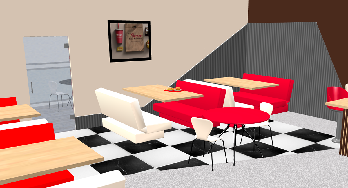
From the moment you enter “Burger Time Machine,” you get the sense that you are in multiple places in time. By incorporating timeless natural materials and finishes popular today, with furnishings and treatments from the past, the customer gets to experience something new. It’s not dated, and it’s not the status quo, it’s anachronous, while remaining beautifully consistent.


Finally, we added patio dining, to complete the dining experience. Post-COVID has influenced the foodservice industry to improve dining experiences, as well as providing dining options. By Adding outdoor dining, and preparing a large counterspace for takeout orders, Burger Time Machine is positioned to compete.
